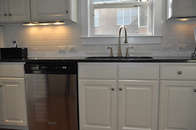
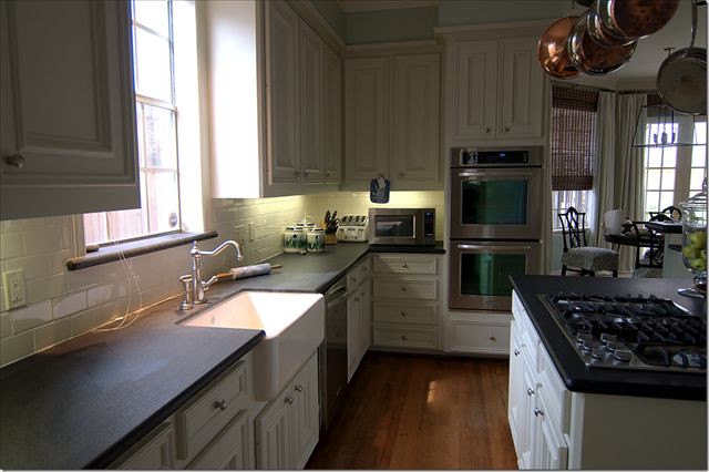
Joni also featured a reader's renovation here, and this is the kitchen that I absolutely adore. She posts fabulous before and after photos as well as photos from her own kitchen. A couple of my favorite from her reader's kitchen are below
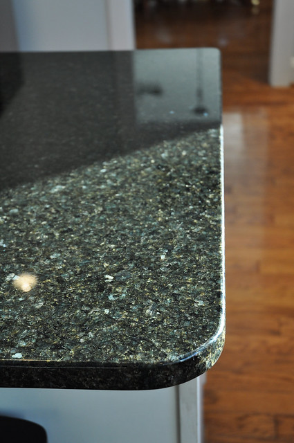
Our own little renovation is finally complete. I really do love it considering we started with just replacing the countertops. This project cost just under $5k, and I think it was money well spent in adding value to our home.
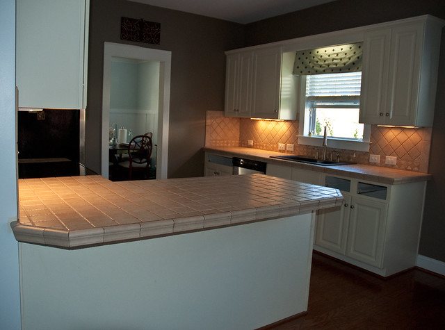
In case you have not seen the other renovation posts, this is our kitchen before...
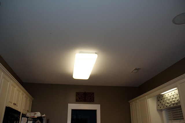
We had dark brown walls and fluorescent lights both on the ceiling and over the kitchen sink.
Links to the first three blog posts are Part One, Part Two and Part Three.
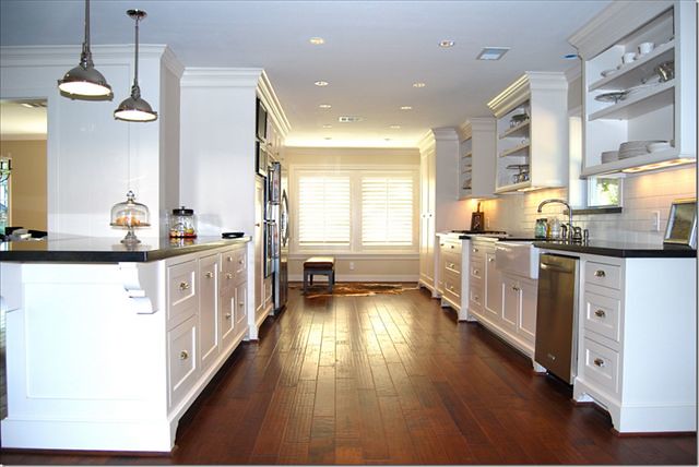
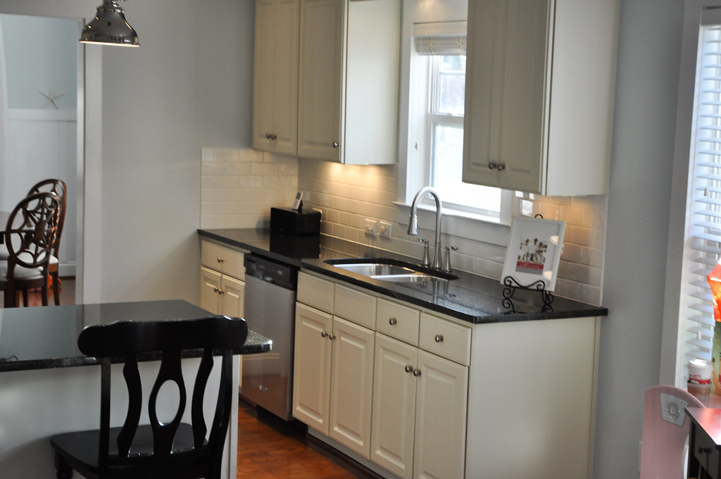
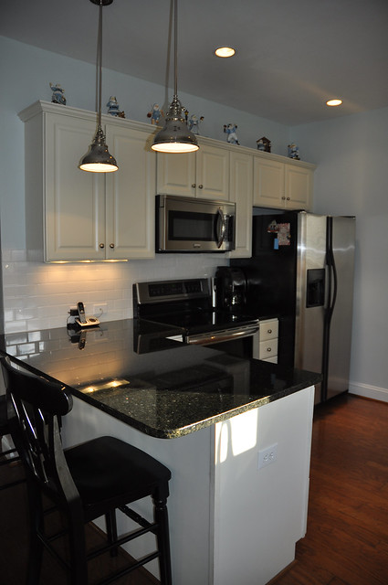
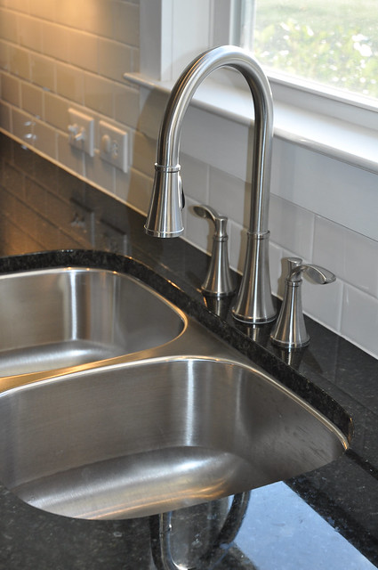
And now for our big reveal:
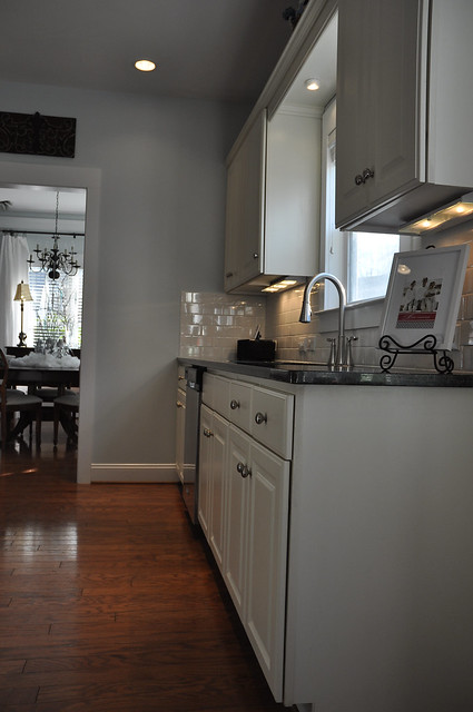
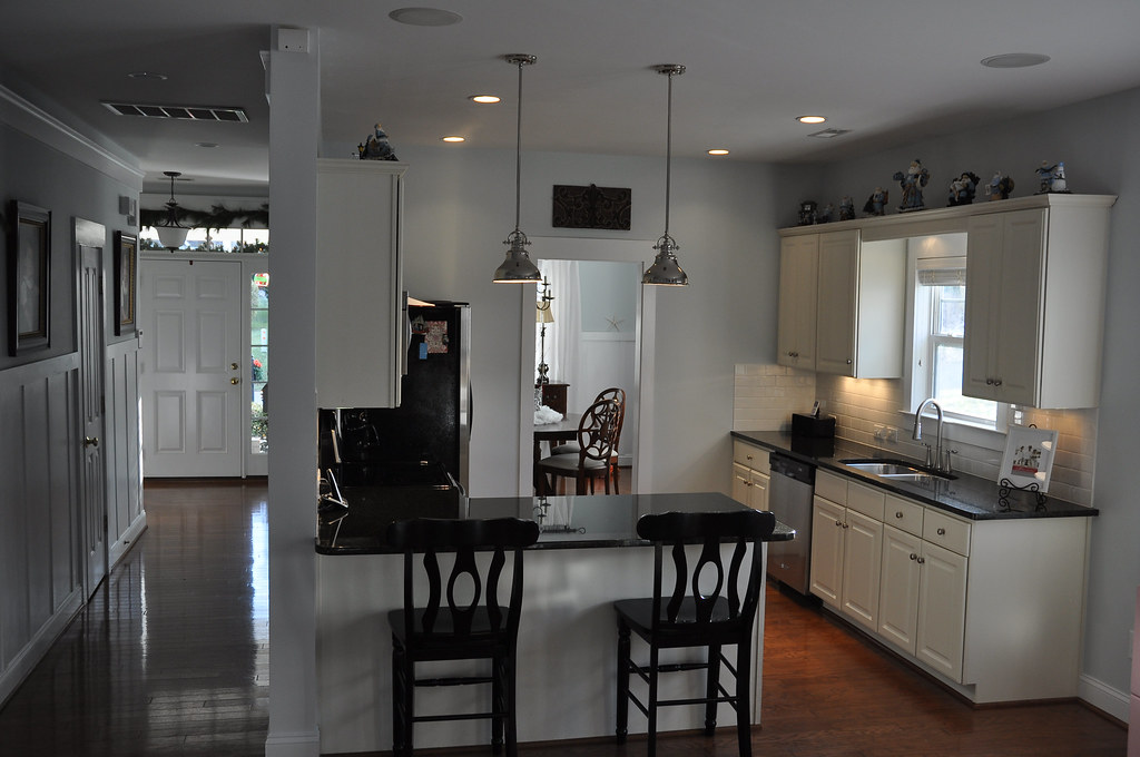 I love this photo because it also shows our main hallway and front door. My mom and I recently added the board and batten to the foyer, hallway and dining room - I. LOVE. IT!!!
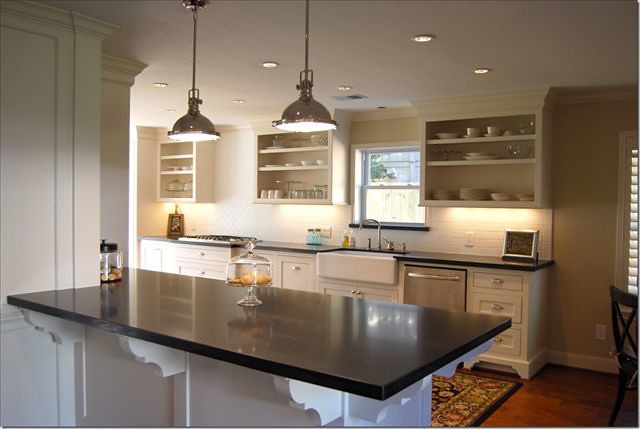
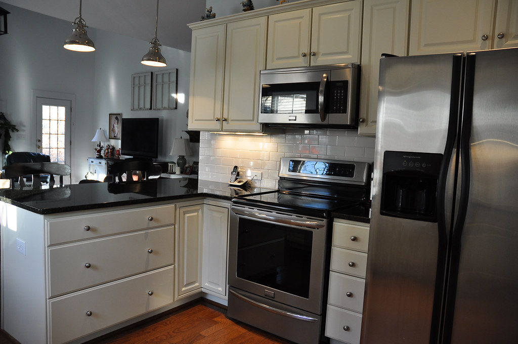
Remember that ugly light and those really dark walls...well, no more:
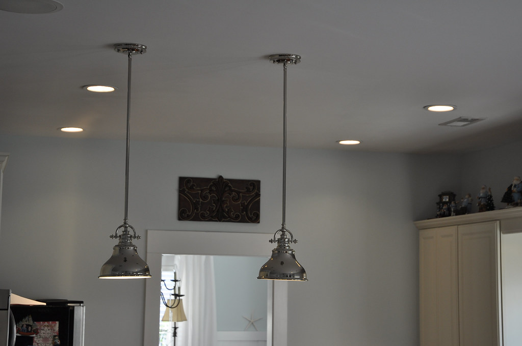
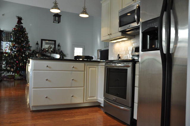
I found these economical pendant lights at Lamps USA.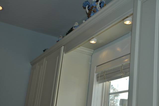
The paint color that I chose for the kitchen and above the board and batten is Benjamin Moore's Iceberg. This color ties the entry, dining room and kitchen together.
My least favorite thing about my kitchen now is that ugly refrigerator sticking out...I need to come up with a solution! Any ideas???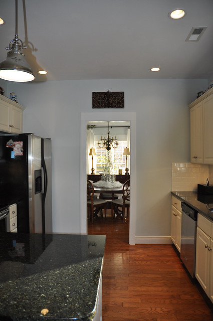
We LOVE our new kitchen. We LOVE that we didn't spend a fortune. We LOVE that our new kitchen is all ours.
14 comments:
Love it!!
It turned out wonderfully! Love your inspiration blog and photos. I too enjoy peeking in on what she is up to. I've borrowed many of her tips and designs along the way.
Enjoy your new kitchen and your savings ~ that's such a good feeling!
Jo
Very nice!
If you are willing to replace the refrigerator, cabinet depth models are available.
Holy cow! That turned out fabulous! Enjoy your new space!
Beautiful - I love it!
You did a GREAT job! It looks beautiful and what a great price. I think you should go for it with Emma's hair!!!!
Thanks for stopping by my blog and enjoying all the cotttages.
I love your blogs and I have a solution for the fridge.
Box it in to the ceiling could use beaded plywood so no sheet rock dust. Completely Elimate the over the fridge cabinet ...It.make it stand out even morethe differences of the depth or bring it out as far as the fridge comes.
They make a counter depth one but it is expensive. You kitchen is great.
Gorgeous! Love it all! Especially the pendant lights!!!
beautiful kitchen - my exact taste! we still need lighting so thanks for that link :)
I have a son from Ukraine and a daughter from China!
You did a great job, I know you LOVE it ! The hallway looks amazing too.
I'm visiting from cote de texas. You did such a fantastic job on your kitchen. Thanks for sharing your story. Very inspirational!
I actually don't mind if the fridge sticks out. You could accessorize on the top of it. In fact I didn't even notice it, I was so enthralled by the makeover. Also you pay so much more for the counter depth fridge...never understood why it cost more to have less space. Anyway, you kitchen redo is fantastic!
Sheila
Absolutely gorgeous!!!!!
m ^..^
Looks great! Thanks for the great ideas!
Post a Comment