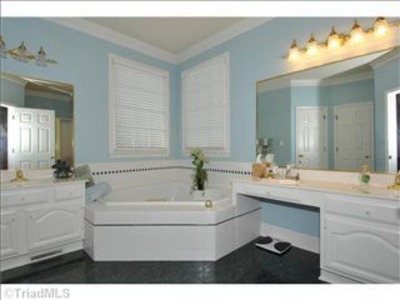
Here is the BEFORE photo of the master bath when we bought our house:
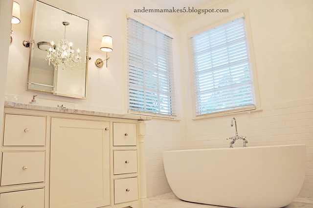
And here it is today...
Please pardon the darker/yellowish photos. I actually cleaned the bathroom this weekend and wanted to snap some photos, but it was very dreary and rainy outside so I had to turn on the lights. The photo above is the view when looking into the bathroom from the master bedroom. The door is on a 45 degree angle.
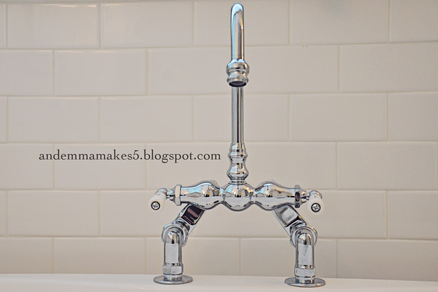
I still really love the faucet that we chose for the bathtub.
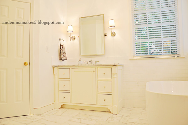
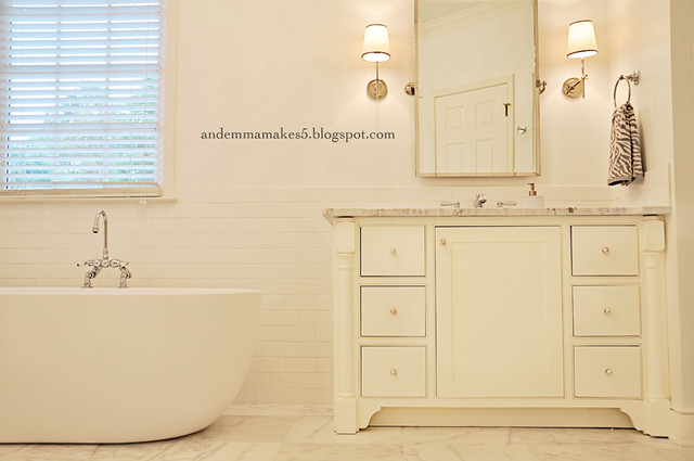
In the next photo, you can see JC's vanity. The door to the left leads to the water closet.
Opposite the windows is the shower that we enlarged and had tiled. We LOVE it! We are also really enjoying the oversized Kohler Rainmaker shower head.

The door that you see to the right is the doorway to our bedroom. I am still really loving the sconces on either side of the mirrors and the crystal chandelier.
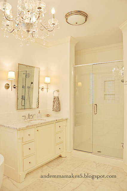
The other light fixture you see is also the vent for the bathroom. That is one of the only thing that we left original. I really like it! It is a little more interesting than the standard light/vent combos that you usually find in bathrooms.
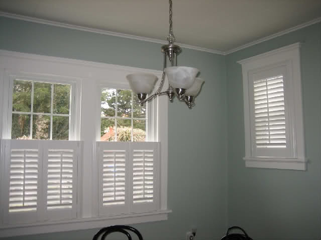
The first thing I would like to do is find a solution for replacing the blinds on both of the windows in the bathroom. They are old and don't work all that well, and I don't think they really go in this space. The two options I am considering are either replacing them with functional plantation shutters that would only cover the bottom halves of the windows...
As I stated before, we are so happy with the way the bathroom turned out. If you would like to know the sources of our selections, you can find those in THIS POST.
I am not crazy about the orientation of the freestanding bathtub. When we originally started planning the bathroom, it was supposed to sit across that corner. Once the vanities were installed, there was just not enough room on the far wall to accommodate the bathtub like that. Therefore, it had to be placed along the same wall as my vanity.
I still really love the faucet that we chose for the bathtub.

In the next photo, you can see JC's vanity. The door to the left leads to the water closet.

Opposite the windows is the shower that we enlarged and had tiled. We LOVE it! We are also really enjoying the oversized Kohler Rainmaker shower head.

The door that you see to the right is the doorway to our bedroom. I am still really loving the sconces on either side of the mirrors and the crystal chandelier.

The other light fixture you see is also the vent for the bathroom. That is one of the only thing that we left original. I really like it! It is a little more interesting than the standard light/vent combos that you usually find in bathrooms.
Things still left to change or add:
The first thing I would like to do is find a solution for replacing the blinds on both of the windows in the bathroom. They are old and don't work all that well, and I don't think they really go in this space. The two options I am considering are either replacing them with functional plantation shutters that would only cover the bottom halves of the windows...
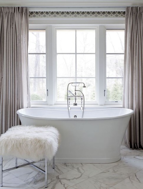
or removing the existing blinds and hanging draperies that could be pulled closed when we are in the bathroom...
via Pinterest
Eventually, I would also like to change out the brassy gold door knobs that are in some of the rooms including the Master Bath. Gold is definitely making a come back in design, but I am not sure that these doorknobs apply to that!
As I stated before, we are so happy with the way the bathroom turned out. If you would like to know the sources of our selections, you can find those in THIS POST.

5 comments:
wow! Looks great :) Enjoy it! We are just LOVING our new master bath. Nice job!!!
Love the free standing tub! Everything is beautiful!!!
You guys did a great job! Bring on the house pictures!
I love it!! You did an awesome job! We are planning on redoing our master bath as soon as we get one of our girls out of college.... that is in May and I cannot wait! I am planning on doing a lot of similar things. I love the look of the marble and subway tile.
It looks amazing. The tub is so cool.
Post a Comment