Here are two photos from the MLS listing that was online when we bought the house. I completely forgot to take a "before" photo from after we moved in.
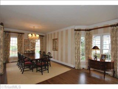
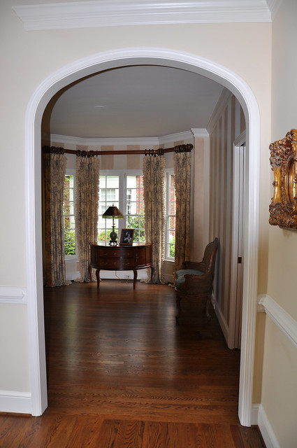
I've never been a fan of these stripes...it's not that I don't like stripes, I just really don't like the paint colors that they chose when it was painted.
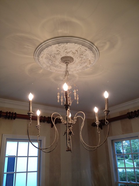
The previous owners took the existing crystal chandelier, but we had already purchased one for the dining room when we thought we were going to build a house so it all worked out.
I blogged about the chandelier HERE back in August.
And here is a photo of it actually hanging in the dining room.
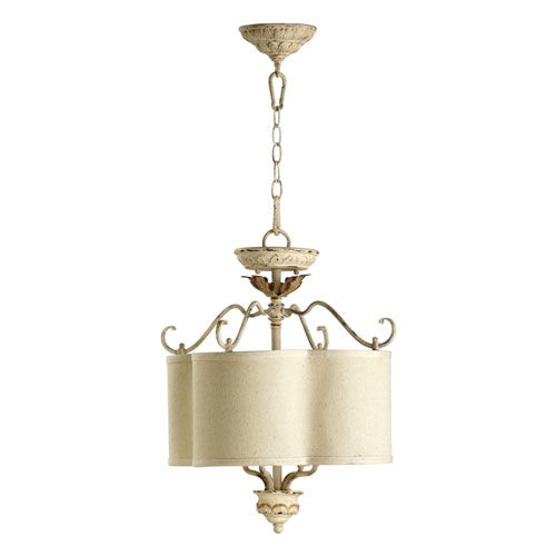
There are actually two spots for ceiling lights in this space so we ordered a complimentary fixture from the Salento Collection for the "living room" space from Bellacor.
You can see the odd shape of the living/dining room combination...

We do not really have "living room" furniture so honestly, most of our dining room furniture will spill into this space. One light fixture was just not enough for both areas though.
We left everything the way it was in the dining room until after Christmas including the enormous drapery rods that were left behind.
My Christmas present from JC was to add a 5' variation of wainscoting.
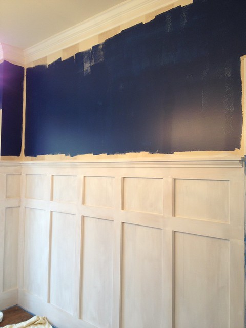
Here are some pictures at the start of the project...
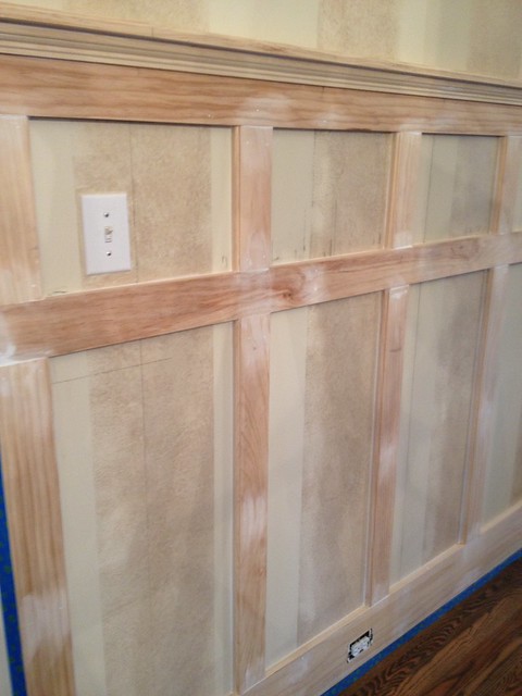
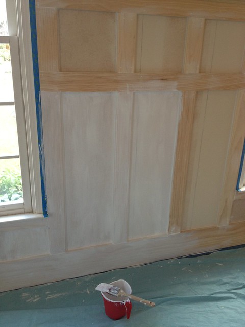
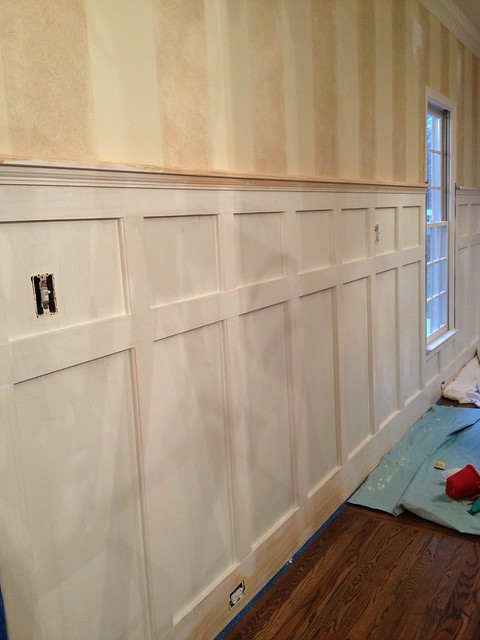
I used Kilz primer for the first coat.
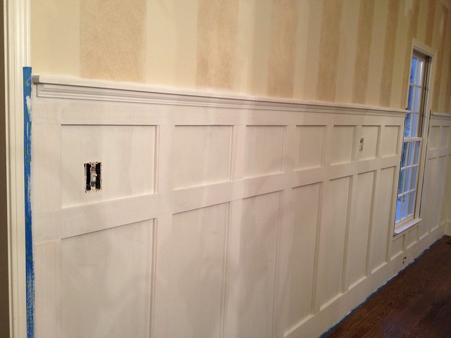
Now I am about a third of the way around the room with the second coat of trim paint that I had Sherwin Williams colormatch for me.
All along, I had envisioned something dramatic in this large space. Before the renovations, I often referred to it as "cavernous".
I have been drawn to navy! Blue is my absolute favorite color...all shades really.
Here are some inspiration photos that I found on www.houzz.com

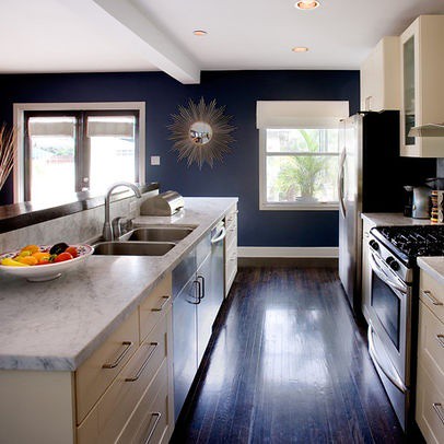
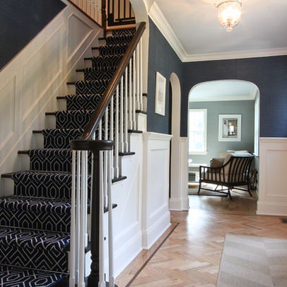
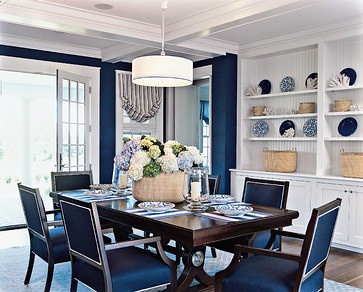
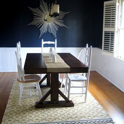
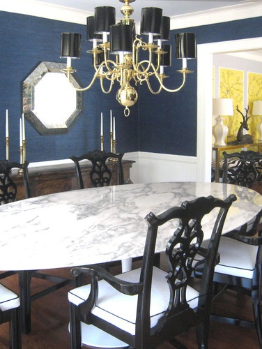
I love the contrast between the dark navy and the white trim.
I am having trouble narrowing down a color though.
While I was getting the trim paint, I had Sherwin Williams mix up a sample of their color called Commodore. It looked really dark in the store, but in our dining space, it is very royal blue...a little lighter than I wanted.
I am now considering two navy blues from Benjamin Moore. I do not have samples yet, but I will get both and paint on the walls before making a final decision.
The first is called Old Navy. It is a little lighter than I think I probably want as well.
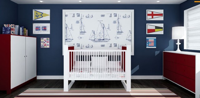
image from B. Moore
And Polo Blue also from Benjamin Moore:
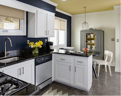
image from B. Moore
I am leaning toward the Polo Blue just from looking at the paint color card.
I can't wait to see what each of these looks like up on the wall.
I am a little hesitant though...navy is pretty dramatic - I've really trended toward light paint colors for a while now. I feel like the dining room can handle the dark color in the remaining space above all of that wainscoting. The good news is it will probably only take one gallon of paint and a Saturday afternoon...easy-peasy to change if I hate it!
4 comments:
love the last color!!!!!
Have you tried Kensington Blue by Benjamin Moore? That is a really pretty blue.
Wow! How exciting! I love, love, love the wainscoting! It is very similar to our new house!
You have great taste! I love that chandelier!
I used Old Navy at out beach house in some bathrooms. They have bead board on the bottom and then the Old Navy on top. I can send you a picture if you want and if it would help get a different perspective.
I also did an accent color in a dark dark blue at the back of a staircase there. It doesn't even stand out too much in a crazy way. It is very neutral there.
I want so badly to use it in our home in Raleigh, but I gotta get one girl out of college before I start redoing another house!! :) Hurry Up May!
Post a Comment