Well....
I chickened out!
Our dining room is on the front of the house and really only gets good daylight in the morning hours. Having the dark color on the walls made that space look even darker and uninviting at night.
So I decided to consult my dear friend's Benjamin Moore paint fandeck once again. This time I focused on the the Historical Collection and after 2 more paint samples chose
If you click on the link above you can see that the sample is pretty light in nature. It does appear much darker in our dining room though.
I snapped a bunch of photos this afternoon and didn't really edit them all that much since changing the "lightness" of the photos altered the true paint color of the room.
Here is the paint before...
And here it is now...this is a view looking into the dining room from the kitchen. We actually switched the space up and moved the table to where it was intended by the architect.

This is the listing photo taken from the hallway door looking into the dining room
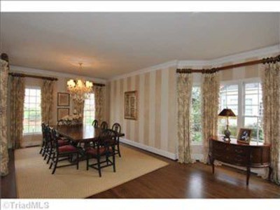
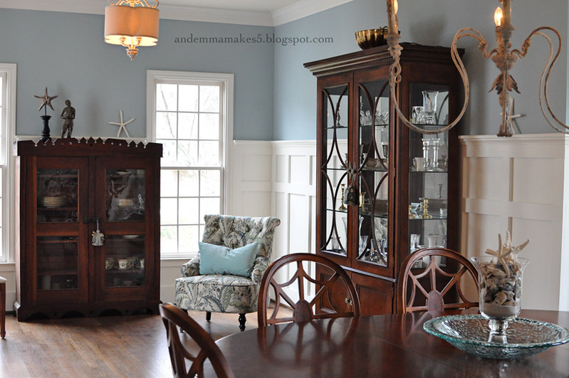
And this was taken from the same vantage point (minus the wide angle lens):
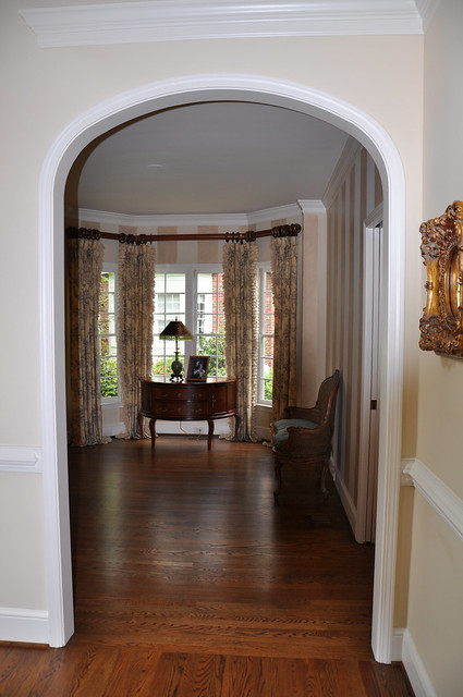
And the listing photo looking into the dining/living room from the main level hallway:
Here is the same view this afternoon...
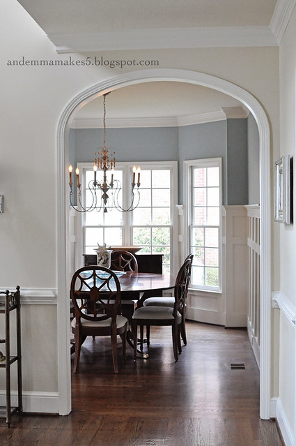
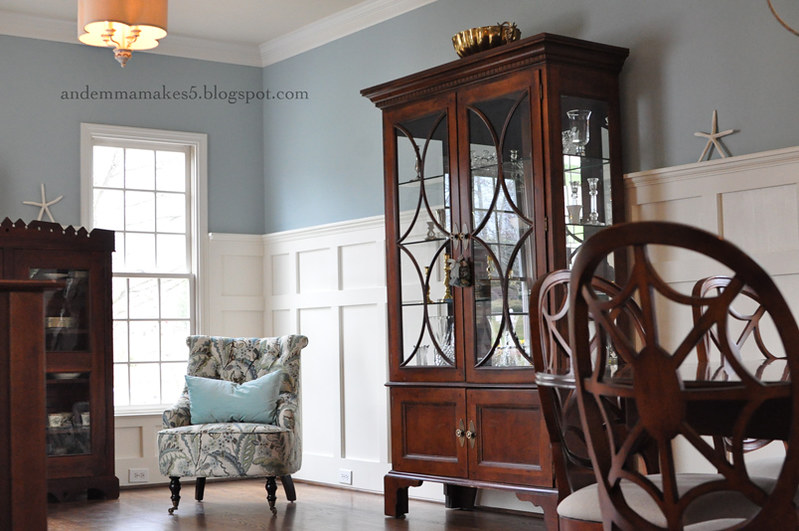
Just yesterday I moved the upholstered chair into the new "living room" space from our master bedroom. It is a better fit in the living room I think. I found the chair at World Market on sale and used a coupon so it was very economical.

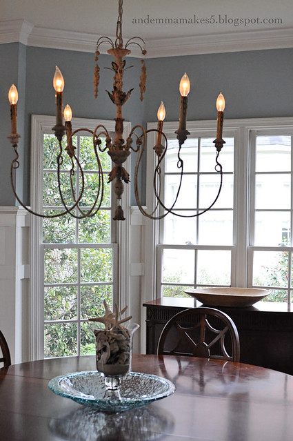
I'm still loving the chandelier we purchased to go over the dining table.
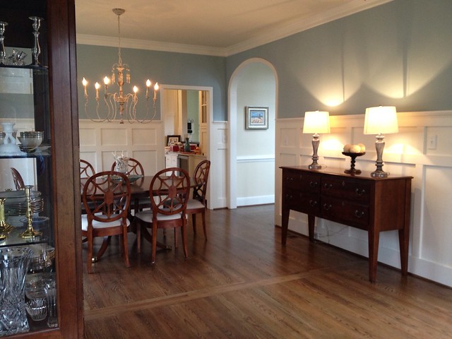
Here's another vantage point...I was standing behind the upholstered chair to snap this one looking into the dining space.

Same vantage point but taken with iPhone (wider angle):
And here is a photo which shows the bay window...

There are still things that I want to do in this space. First will be to purchase window hardware and hang the draperies that I already have.
Next is to get a rug and some sort of loveseat or matching chairs to go opposite the upholstered chair that is in the space now.
Still lots to do...surprisingly I am just taking it one step at a time instead of trying to rush and get everything finished to say it is finished.
I will say that I am very happy with my "SAFE" color choice. There is a reason this is one of Benjamin Moore's most popular colors. It really is beautiful up on the walls!

Just yesterday I moved the upholstered chair into the new "living room" space from our master bedroom. It is a better fit in the living room I think. I found the chair at World Market on sale and used a coupon so it was very economical.


I'm still loving the chandelier we purchased to go over the dining table.

Here's another vantage point...I was standing behind the upholstered chair to snap this one looking into the dining space.

Same vantage point but taken with iPhone (wider angle):

And here is a photo which shows the bay window...

There are still things that I want to do in this space. First will be to purchase window hardware and hang the draperies that I already have.
Next is to get a rug and some sort of loveseat or matching chairs to go opposite the upholstered chair that is in the space now.
Still lots to do...surprisingly I am just taking it one step at a time instead of trying to rush and get everything finished to say it is finished.
I will say that I am very happy with my "SAFE" color choice. There is a reason this is one of Benjamin Moore's most popular colors. It really is beautiful up on the walls!


4 comments:
I've been following your blog for a while and really enjoy it. Your renovations have been beautiful as is your Dining Room. Your choice of color is perfect. It looks like it should be in a magazine. Look forward to more pictures of your re-do's!
It looks BEAUTIFUL!!!! Y'all did such a nice job and I love that paint color !!!
Wow! Way to go! That turned out fabulous! I, too, love that color.
You definitely have decorating style!!! This turned out just amazing. You picked a great house Corey & JC!
Post a Comment